
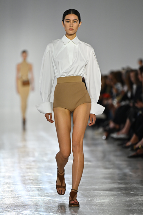
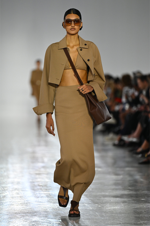
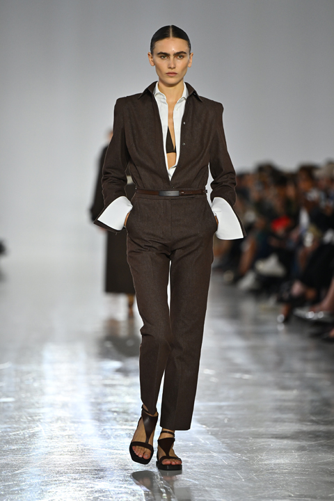
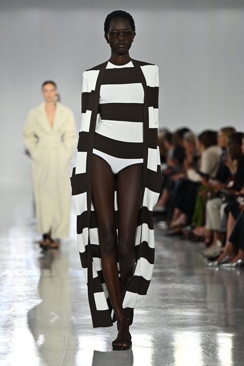
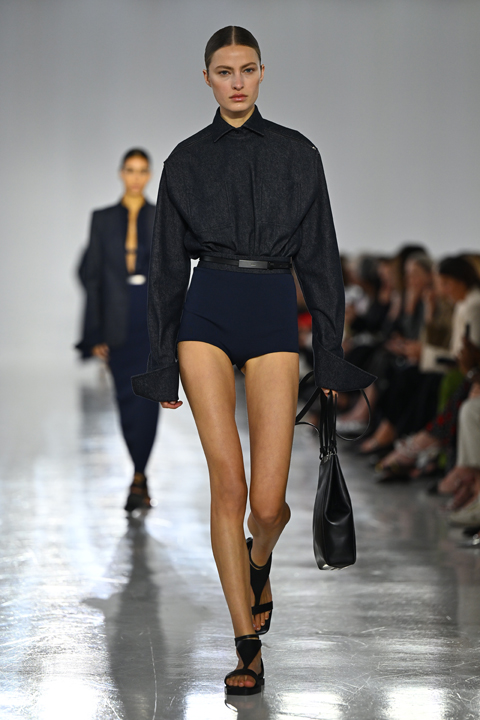
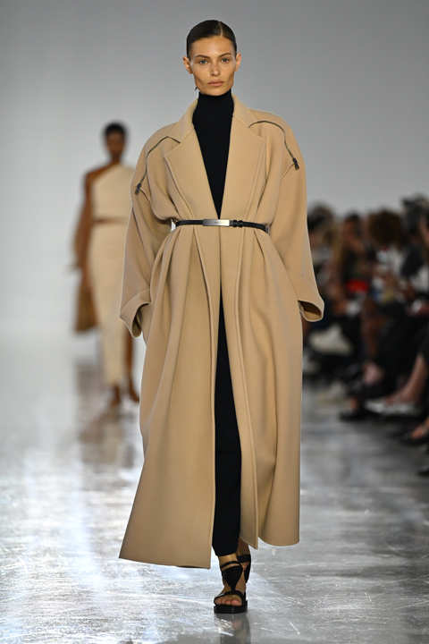
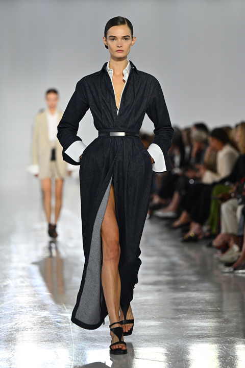
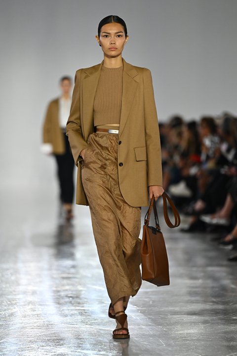
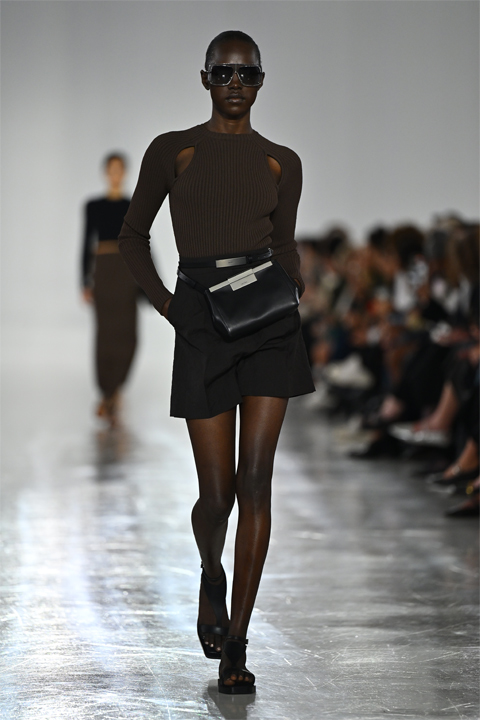
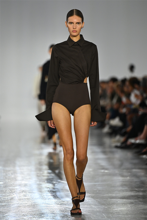
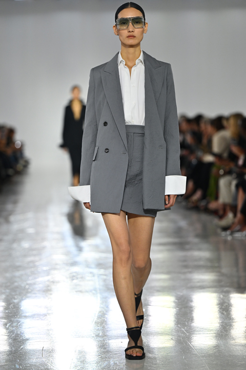
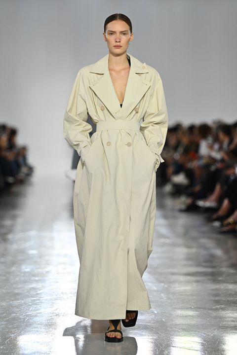
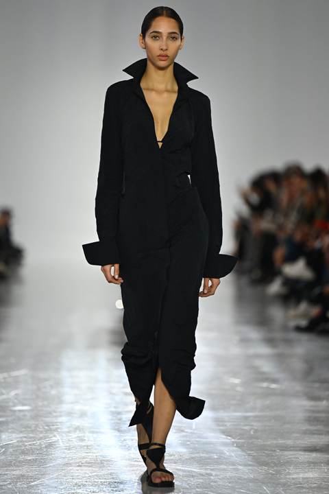
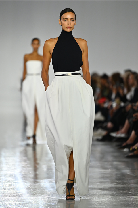
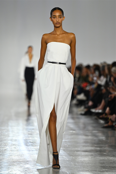
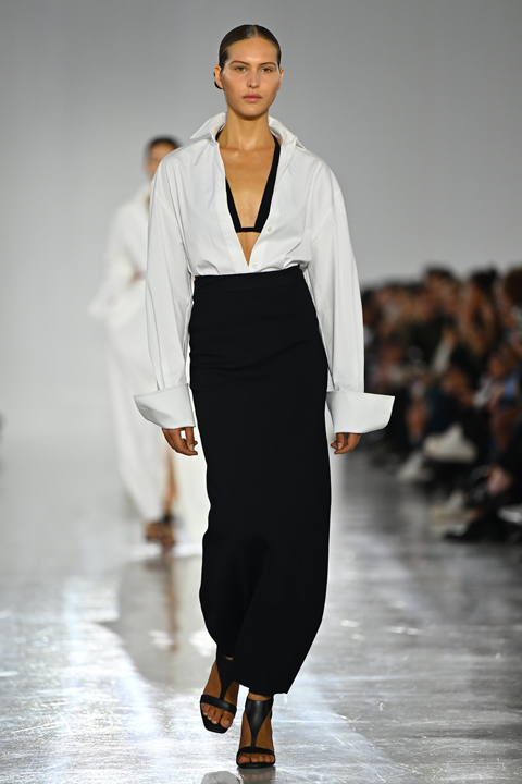
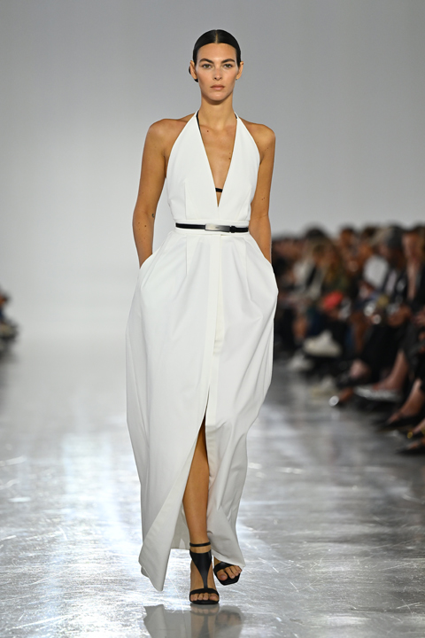
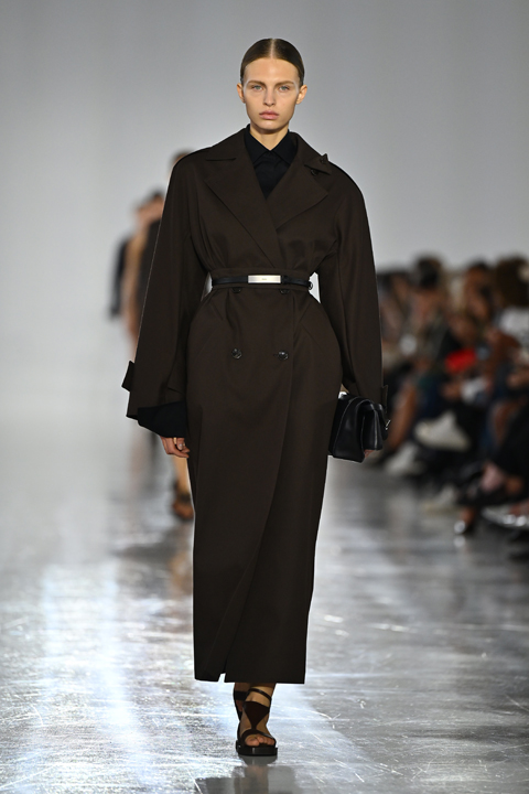
Milano Moda Haftası: Max Mara İlkbahar-Yaz 2025 Defilesi

Max Mara 2025 İlkbahar – Yaz defilesi, bizi sayılar ve şekillerin büyülü dünyasına davet ediyor. Matematik ve fiziğin karmaşık denklemlerini, şık ve modern tasarımlara dönüştürerek, moda ile bilimi kusursuz bir şekilde harmanlıyor. Koleksiyonun ilham kaynağı, 4. yüzyıl İskenderiye’sinin ünlü matematikçisi Hypatia… Hypatia’nın geometrik çalışmaları, Max Mara tasarımlarında üç boyutlu yapılar oluşturmak için kullanılan çizgiler ve formlarda kendini gösteriyor
1/19
.circle {
position: relative;
width: 70px;
height: 70px;
cursor: pointer;
}
.circle svg {
fill: none;
stroke: #8a3ab9;
stroke-linecap: round;
stroke-width: 3;
stroke-dasharray: 1;
stroke-dashoffset: 0;
animation: stroke-draw 2s cubic-bezier(0.77, 0, 0.175, 1) infinite alternate;
display:block!important
}
.circle img {
position: absolute;
left: 50%;
top: 50%;
transform: translate(-50%, -50%);
border-radius: 50%;
}
@keyframes stroke-draw {
from {
stroke: #8a3ab9;
stroke-dasharray: 1;
}
to {
stroke: #cd486b;
transform: rotate(180deg);
stroke-dasharray: 8;
}
}
2/19
.circle {
position: relative;
width: 70px;
height: 70px;
cursor: pointer;
}
.circle svg {
fill: none;
stroke: #8a3ab9;
stroke-linecap: round;
stroke-width: 3;
stroke-dasharray: 1;
stroke-dashoffset: 0;
animation: stroke-draw 2s cubic-bezier(0.77, 0, 0.175, 1) infinite alternate;
display:block!important
}
.circle img {
position: absolute;
left: 50%;
top: 50%;
transform: translate(-50%, -50%);
border-radius: 50%;
}
@keyframes stroke-draw {
from {
stroke: #8a3ab9;
stroke-dasharray: 1;
}
to {
stroke: #cd486b;
transform: rotate(180deg);
stroke-dasharray: 8;
}
}
3/19
.circle {
position: relative;
width: 70px;
height: 70px;
cursor: pointer;
}
.circle svg {
fill: none;
stroke: #8a3ab9;
stroke-linecap: round;
stroke-width: 3;
stroke-dasharray: 1;
stroke-dashoffset: 0;
animation: stroke-draw 2s cubic-bezier(0.77, 0, 0.175, 1) infinite alternate;
display:block!important
}
.circle img {
position: absolute;
left: 50%;
top: 50%;
transform: translate(-50%, -50%);
border-radius: 50%;
}
@keyframes stroke-draw {
from {
stroke: #8a3ab9;
stroke-dasharray: 1;
}
to {
stroke: #cd486b;
transform: rotate(180deg);
stroke-dasharray: 8;
}
}
4/19
.circle {
position: relative;
width: 70px;
height: 70px;
cursor: pointer;
}
.circle svg {
fill: none;
stroke: #8a3ab9;
stroke-linecap: round;
stroke-width: 3;
stroke-dasharray: 1;
stroke-dashoffset: 0;
animation: stroke-draw 2s cubic-bezier(0.77, 0, 0.175, 1) infinite alternate;
display:block!important
}
.circle img {
position: absolute;
left: 50%;
top: 50%;
transform: translate(-50%, -50%);
border-radius: 50%;
}
@keyframes stroke-draw {
from {
stroke: #8a3ab9;
stroke-dasharray: 1;
}
to {
stroke: #cd486b;
transform: rotate(180deg);
stroke-dasharray: 8;
}
}
5/19
.circle {
position: relative;
width: 70px;
height: 70px;
cursor: pointer;
}
.circle svg {
fill: none;
stroke: #8a3ab9;
stroke-linecap: round;
stroke-width: 3;
stroke-dasharray: 1;
stroke-dashoffset: 0;
animation: stroke-draw 2s cubic-bezier(0.77, 0, 0.175, 1) infinite alternate;
display:block!important
}
.circle img {
position: absolute;
left: 50%;
top: 50%;
transform: translate(-50%, -50%);
border-radius: 50%;
}
@keyframes stroke-draw {
from {
stroke: #8a3ab9;
stroke-dasharray: 1;
}
to {
stroke: #cd486b;
transform: rotate(180deg);
stroke-dasharray: 8;
}
}
6/19
.circle {
position: relative;
width: 70px;
height: 70px;
cursor: pointer;
}
.circle svg {
fill: none;
stroke: #8a3ab9;
stroke-linecap: round;
stroke-width: 3;
stroke-dasharray: 1;
stroke-dashoffset: 0;
animation: stroke-draw 2s cubic-bezier(0.77, 0, 0.175, 1) infinite alternate;
display:block!important
}
.circle img {
position: absolute;
left: 50%;
top: 50%;
transform: translate(-50%, -50%);
border-radius: 50%;
}
@keyframes stroke-draw {
from {
stroke: #8a3ab9;
stroke-dasharray: 1;
}
to {
stroke: #cd486b;
transform: rotate(180deg);
stroke-dasharray: 8;
}
}
7/19
.circle {
position: relative;
width: 70px;
height: 70px;
cursor: pointer;
}
.circle svg {
fill: none;
stroke: #8a3ab9;
stroke-linecap: round;
stroke-width: 3;
stroke-dasharray: 1;
stroke-dashoffset: 0;
animation: stroke-draw 2s cubic-bezier(0.77, 0, 0.175, 1) infinite alternate;
display:block!important
}
.circle img {
position: absolute;
left: 50%;
top: 50%;
transform: translate(-50%, -50%);
border-radius: 50%;
}
@keyframes stroke-draw {
from {
stroke: #8a3ab9;
stroke-dasharray: 1;
}
to {
stroke: #cd486b;
transform: rotate(180deg);
stroke-dasharray: 8;
}
}
8/19
.circle {
position: relative;
width: 70px;
height: 70px;
cursor: pointer;
}
.circle svg {
fill: none;
stroke: #8a3ab9;
stroke-linecap: round;
stroke-width: 3;
stroke-dasharray: 1;
stroke-dashoffset: 0;
animation: stroke-draw 2s cubic-bezier(0.77, 0, 0.175, 1) infinite alternate;
display:block!important
}
.circle img {
position: absolute;
left: 50%;
top: 50%;
transform: translate(-50%, -50%);
border-radius: 50%;
}
@keyframes stroke-draw {
from {
stroke: #8a3ab9;
stroke-dasharray: 1;
}
to {
stroke: #cd486b;
transform: rotate(180deg);
stroke-dasharray: 8;
}
}
9/19
.circle {
position: relative;
width: 70px;
height: 70px;
cursor: pointer;
}
.circle svg {
fill: none;
stroke: #8a3ab9;
stroke-linecap: round;
stroke-width: 3;
stroke-dasharray: 1;
stroke-dashoffset: 0;
animation: stroke-draw 2s cubic-bezier(0.77, 0, 0.175, 1) infinite alternate;
display:block!important
}
.circle img {
position: absolute;
left: 50%;
top: 50%;
transform: translate(-50%, -50%);
border-radius: 50%;
}
@keyframes stroke-draw {
from {
stroke: #8a3ab9;
stroke-dasharray: 1;
}
to {
stroke: #cd486b;
transform: rotate(180deg);
stroke-dasharray: 8;
}
}
10/19
.circle {
position: relative;
width: 70px;
height: 70px;
cursor: pointer;
}
.circle svg {
fill: none;
stroke: #8a3ab9;
stroke-linecap: round;
stroke-width: 3;
stroke-dasharray: 1;
stroke-dashoffset: 0;
animation: stroke-draw 2s cubic-bezier(0.77, 0, 0.175, 1) infinite alternate;
display:block!important
}
.circle img {
position: absolute;
left: 50%;
top: 50%;
transform: translate(-50%, -50%);
border-radius: 50%;
}
@keyframes stroke-draw {
from {
stroke: #8a3ab9;
stroke-dasharray: 1;
}
to {
stroke: #cd486b;
transform: rotate(180deg);
stroke-dasharray: 8;
}
}
11/19
.circle {
position: relative;
width: 70px;
height: 70px;
cursor: pointer;
}
.circle svg {
fill: none;
stroke: #8a3ab9;
stroke-linecap: round;
stroke-width: 3;
stroke-dasharray: 1;
stroke-dashoffset: 0;
animation: stroke-draw 2s cubic-bezier(0.77, 0, 0.175, 1) infinite alternate;
display:block!important
}
.circle img {
position: absolute;
left: 50%;
top: 50%;
transform: translate(-50%, -50%);
border-radius: 50%;
}
@keyframes stroke-draw {
from {
stroke: #8a3ab9;
stroke-dasharray: 1;
}
to {
stroke: #cd486b;
transform: rotate(180deg);
stroke-dasharray: 8;
}
}
12/19
.circle {
position: relative;
width: 70px;
height: 70px;
cursor: pointer;
}
.circle svg {
fill: none;
stroke: #8a3ab9;
stroke-linecap: round;
stroke-width: 3;
stroke-dasharray: 1;
stroke-dashoffset: 0;
animation: stroke-draw 2s cubic-bezier(0.77, 0, 0.175, 1) infinite alternate;
display:block!important
}
.circle img {
position: absolute;
left: 50%;
top: 50%;
transform: translate(-50%, -50%);
border-radius: 50%;
}
@keyframes stroke-draw {
from {
stroke: #8a3ab9;
stroke-dasharray: 1;
}
to {
stroke: #cd486b;
transform: rotate(180deg);
stroke-dasharray: 8;
}
}
13/19
.circle {
position: relative;
width: 70px;
height: 70px;
cursor: pointer;
}
.circle svg {
fill: none;
stroke: #8a3ab9;
stroke-linecap: round;
stroke-width: 3;
stroke-dasharray: 1;
stroke-dashoffset: 0;
animation: stroke-draw 2s cubic-bezier(0.77, 0, 0.175, 1) infinite alternate;
display:block!important
}
.circle img {
position: absolute;
left: 50%;
top: 50%;
transform: translate(-50%, -50%);
border-radius: 50%;
}
@keyframes stroke-draw {
from {
stroke: #8a3ab9;
stroke-dasharray: 1;
}
to {
stroke: #cd486b;
transform: rotate(180deg);
stroke-dasharray: 8;
}
}
14/19
.circle {
position: relative;
width: 70px;
height: 70px;
cursor: pointer;
}
.circle svg {
fill: none;
stroke: #8a3ab9;
stroke-linecap: round;
stroke-width: 3;
stroke-dasharray: 1;
stroke-dashoffset: 0;
animation: stroke-draw 2s cubic-bezier(0.77, 0, 0.175, 1) infinite alternate;
display:block!important
}
.circle img {
position: absolute;
left: 50%;
top: 50%;
transform: translate(-50%, -50%);
border-radius: 50%;
}
@keyframes stroke-draw {
from {
stroke: #8a3ab9;
stroke-dasharray: 1;
}
to {
stroke: #cd486b;
transform: rotate(180deg);
stroke-dasharray: 8;
}
}
15/19
.circle {
position: relative;
width: 70px;
height: 70px;
cursor: pointer;
}
.circle svg {
fill: none;
stroke: #8a3ab9;
stroke-linecap: round;
stroke-width: 3;
stroke-dasharray: 1;
stroke-dashoffset: 0;
animation: stroke-draw 2s cubic-bezier(0.77, 0, 0.175, 1) infinite alternate;
display:block!important
}
.circle img {
position: absolute;
left: 50%;
top: 50%;
transform: translate(-50%, -50%);
border-radius: 50%;
}
@keyframes stroke-draw {
from {
stroke: #8a3ab9;
stroke-dasharray: 1;
}
to {
stroke: #cd486b;
transform: rotate(180deg);
stroke-dasharray: 8;
}
}
16/19
.circle {
position: relative;
width: 70px;
height: 70px;
cursor: pointer;
}
.circle svg {
fill: none;
stroke: #8a3ab9;
stroke-linecap: round;
stroke-width: 3;
stroke-dasharray: 1;
stroke-dashoffset: 0;
animation: stroke-draw 2s cubic-bezier(0.77, 0, 0.175, 1) infinite alternate;
display:block!important
}
.circle img {
position: absolute;
left: 50%;
top: 50%;
transform: translate(-50%, -50%);
border-radius: 50%;
}
@keyframes stroke-draw {
from {
stroke: #8a3ab9;
stroke-dasharray: 1;
}
to {
stroke: #cd486b;
transform: rotate(180deg);
stroke-dasharray: 8;
}
}
17/19
.circle {
position: relative;
width: 70px;
height: 70px;
cursor: pointer;
}
.circle svg {
fill: none;
stroke: #8a3ab9;
stroke-linecap: round;
stroke-width: 3;
stroke-dasharray: 1;
stroke-dashoffset: 0;
animation: stroke-draw 2s cubic-bezier(0.77, 0, 0.175, 1) infinite alternate;
display:block!important
}
.circle img {
position: absolute;
left: 50%;
top: 50%;
transform: translate(-50%, -50%);
border-radius: 50%;
}
@keyframes stroke-draw {
from {
stroke: #8a3ab9;
stroke-dasharray: 1;
}
to {
stroke: #cd486b;
transform: rotate(180deg);
stroke-dasharray: 8;
}
}
18/19
.circle {
position: relative;
width: 70px;
height: 70px;
cursor: pointer;
}
.circle svg {
fill: none;
stroke: #8a3ab9;
stroke-linecap: round;
stroke-width: 3;
stroke-dasharray: 1;
stroke-dashoffset: 0;
animation: stroke-draw 2s cubic-bezier(0.77, 0, 0.175, 1) infinite alternate;
display:block!important
}
.circle img {
position: absolute;
left: 50%;
top: 50%;
transform: translate(-50%, -50%);
border-radius: 50%;
}
@keyframes stroke-draw {
from {
stroke: #8a3ab9;
stroke-dasharray: 1;
}
to {
stroke: #cd486b;
transform: rotate(180deg);
stroke-dasharray: 8;
}
}
19/19
.circle {
position: relative;
width: 70px;
height: 70px;
cursor: pointer;
}
.circle svg {
fill: none;
stroke: #8a3ab9;
stroke-linecap: round;
stroke-width: 3;
stroke-dasharray: 1;
stroke-dashoffset: 0;
animation: stroke-draw 2s cubic-bezier(0.77, 0, 0.175, 1) infinite alternate;
display:block!important
}
.circle img {
position: absolute;
left: 50%;
top: 50%;
transform: translate(-50%, -50%);
border-radius: 50%;
}
@keyframes stroke-draw {
from {
stroke: #8a3ab9;
stroke-dasharray: 1;
}
to {
stroke: #cd486b;
transform: rotate(180deg);
stroke-dasharray: 8;
}
}